Learn how to work with Excel and interactive analysis in SAP HANA. In the latest video in the HANA Difference series watch Carl B. Lewis cover the Excel reporting in SAP HANA. Watch the video.
 In this weeks’ entry of the SAP HANA Difference series, we’ll look at Excel Reports and interactive analysis in the SAP Business One Version for SAP HANA. As a reminder to our readers, many of the features covered in the SAP HANA Difference series are not available in the Microsoft SQL server version of SAP Business One. As SAP continues to build upon its in-memory analytics platform, users can expect that more and more features will leverage the SAP HANA platform.
To that end, Vision33 presents this article series to expose users interested in the SAP HANA platform as well as providing a training opportunity to our customers who may already be using SAP Business One version for SAP HANA so that they may familiarise themselves with the features and benefits that they already have access to.
Exclusive SAP HANA Feature: Excel Report and Interactive Analysis
One useful feature, only available to SAP HANA users, is the Excel Report and Interactive Analysis which can be accessed from the modules column on the left side of the screen. From the main screen in SAP HANA. There are a few viewing options that users can choose from. From the “SAP Fiori interface,” users get a role-based, consumer-grade user experience and visual design that provides an easy-to-use and clean layout. From here click on the menu item and here users will see folders that contain pre-prepared reports out of the box. Further, it is possible to store more reports in these folders, and the function names can help you keep things organised.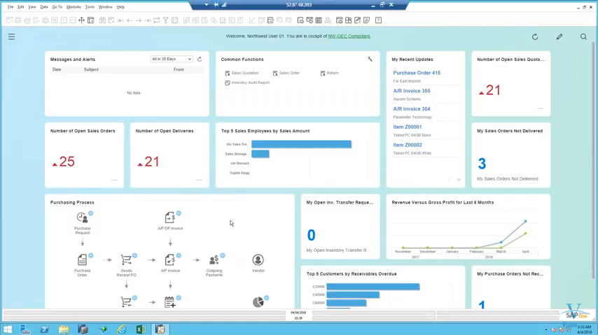
When you click on one of the reports, it will open an Excel spreadsheet below on your desktop computer task bar. SAP has created several system reports, but beyond these, you can even create more of these to make available to users throughout your company as well. In this way, once the report is set up, users do not have to manipulate anything, and can easily access your preconfigured reports. All the while it is still possible to perform calculations on the Excel data once the report has been generated.
Under the Tools menu option, users will also find the Excel Report and Interactive Analysis Designer. It is important to make the distinction between the actual reports that are accessible in the modules column and the report designer found under the Tools menu of SAP HANA. It’s from the Designer where users can customise their reports to analyse data beyond what is available out of the box in SAP HANA.
SAP HANA Data Sets
Another benefit to using SAP HANA is the inclusion of “data sets.” One of the frustrations with creating reports in the past was that to do so; you had to have a data set to begin with. In SAP Business One version for SAP HANA, SAP has provided 12 datasets out of the box. They include things like Purchasing Analysis, Profitability Analysis, Inventory Transaction Documents, and many more. For this example, let’s look at what happens when you select Inventory Transaction Documents. If a user clicks on this, menu item, it will open a report in Microsoft Excel with a Pivot table giving users a great deal of analysis with their data.
Pivot Tables in Microsoft Excel
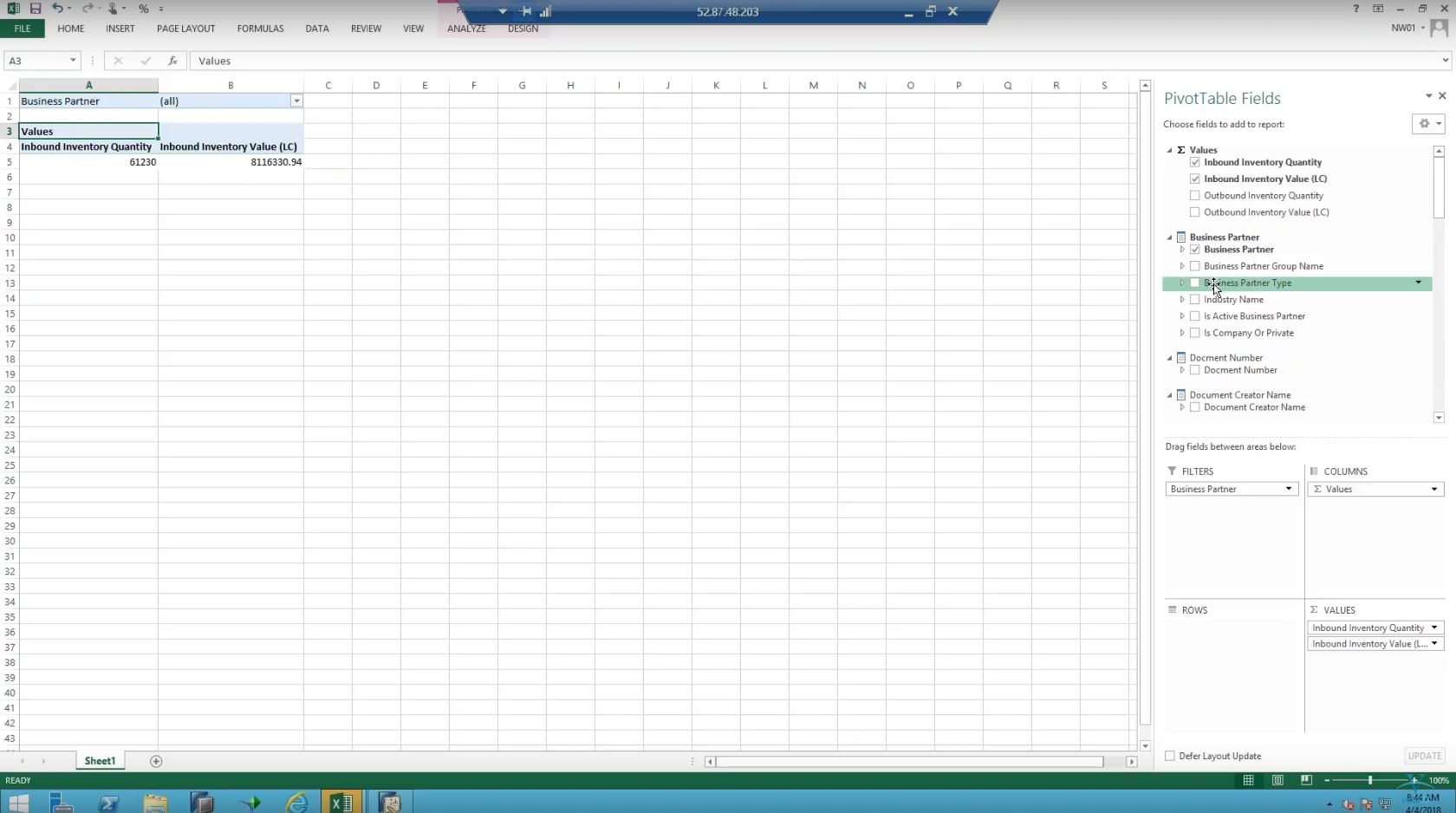
Having clicked on the Inventory Transaction Documents dataset, users will once again see an Excel file generated in their taskbar. Clicking on the taskbar icon will prompt Microsoft Excel and present users with a Pivot Table of data. Under the PivotChart Fields, you can see the fields to add to the report. Preassembled values and equations are accessible here and ready for use. For example, you could look at Inbound Inventory, or you could look at a business partner. Filter by business partner and look at inbound inventory quantity. Using data fields in collaboration with each other will create a PivotChart.
But for now, let’s look at what happens when you select inbound inventory and all business partners from the PivotChart Fields. You can assign the values to different areas including Filters, Legend (series), Axis Categories, and Values. The Filter allows you to be very specific about the data you analyse. In this case, if you want to specifically look at a business partner who is a vendor concerning your inbound inventory, you can add “Business Partner Type” to the Filter. Thinking through the logic of the data you are looking for is necessary.
Once added, the user must then go to the spreadsheet and select the Vendor type from the dropdown menu to filter by the business partner type. You can also look at a specific vendor by using the drop-down menu under business partner, deselecting “All Vendors” and then looking through the list to find the vendor you’re looking for. Users can format the data to reflect their currency.
To analyse multiple business partners at once, a user can drag the business partner data item into the Rows section to the PivotTable Fields and then select “All” in the Filter section. Then the user can analyse the inbound inventory quantity and inbound inventory value for all the customers. Users can also filter by Financial period so that you can analyze by Fiscal year for instance rather than all time.
Can You Save a Custom Report in SAP HANA?
You may be asking yourself, do I have to recreate custom reports each time I want to analyse data? Users have a few options here. You can save the report in a folder, you can send it to someone, but they won’t be able to refresh the data unless they’re part of the same network as your business. It will read from the area-wide network and update the date for them. So, keep that in mind. To avoid having to start over, users can save it in the Documents folder of your computer.
The other option is to save it as a report in SAP HANA so that you can access it from the menu. You can save the report in the SAP HANA menu item but also the Pivot Table and interactive analysis also. Datasets, or semantic layers, cubes – however you reference them – can be saved after you’ve worked on them so that they will be just as you’ve left them.
Once you open a report that you created, you will want to refresh the data. To do so, open the data tab in Excel and hit the Refresh. From here it will ask users for logon credentials even if the user of the report is part of the network. If you have these credentials filled out, the report data will then be updated.
Create Reports That You Can Share with Others
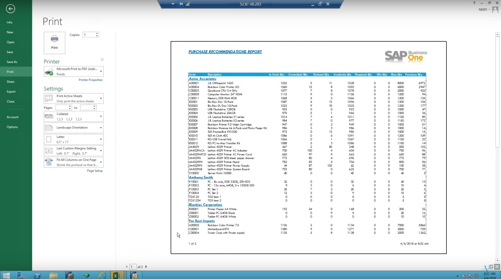
Users should familiarise themselves with the Page Layout menu item in Excel if they’d like to improve the visual aspect of their custom report in Microsoft Excel. Print titles, for instance, provide header and footers – Excel can do a very nice join of presenting the data suitable for printing out on paper so that it’s very easily readable. You can also print multiple tabs at the same time as well, SAP Business One version for SAP HANA gives users a lot of options!
Excel Report and Interactive Designer
Shifting gears, the other thing users should familiarise themselves with is the Excel Report and Interactive Designer item found under the Tools menu in SAP HANA. From this menu item, users can prompt an Excel to open with a few additional options in the menu that allow the user to create their reports and run them with user design. You can then save the report and publish it within SAP Business One. Once you close and reopen the application, the report will appear in the menu. 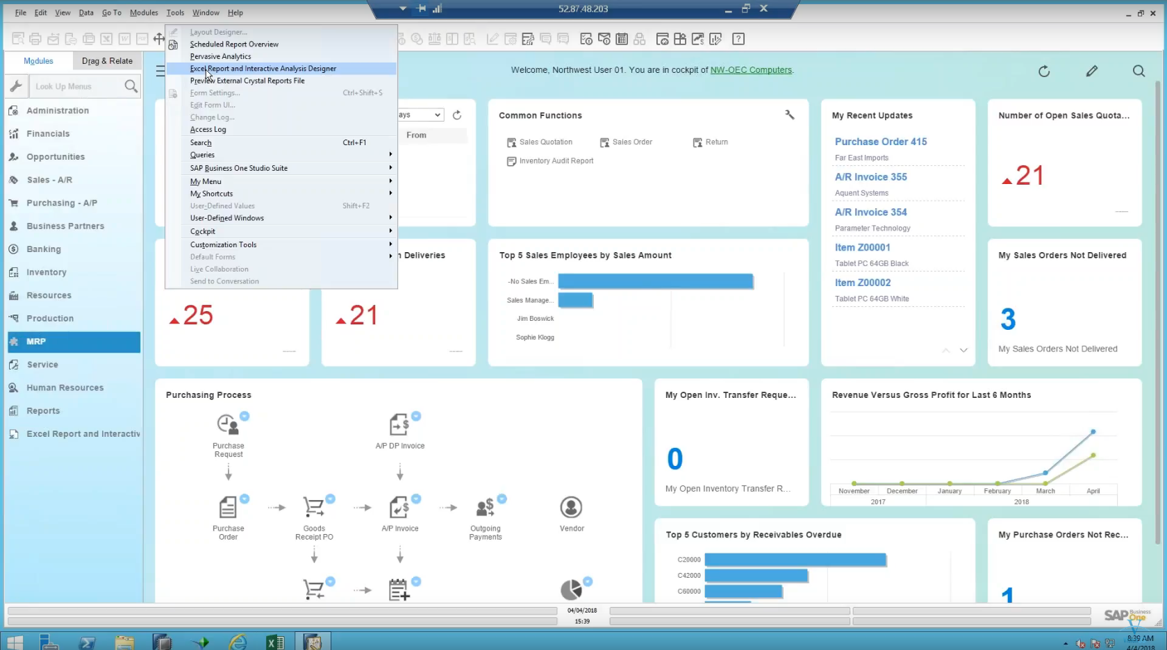 If you’d like to see a live demo running of SAP HANA the Microsoft Excel Report and Interactive Designer, watch the Excel Reports and Interactive Analysis video presented by Vision33’s Carl B. Lewis, SAP Business One Ambassador. In the video, Lewis covers everything discussed above but then takes it a step further and demonstrates how users can customise their datasets and make reports even more tailored to your business’ informational needs.

